Using and Viewing Charts
Filtering Charts
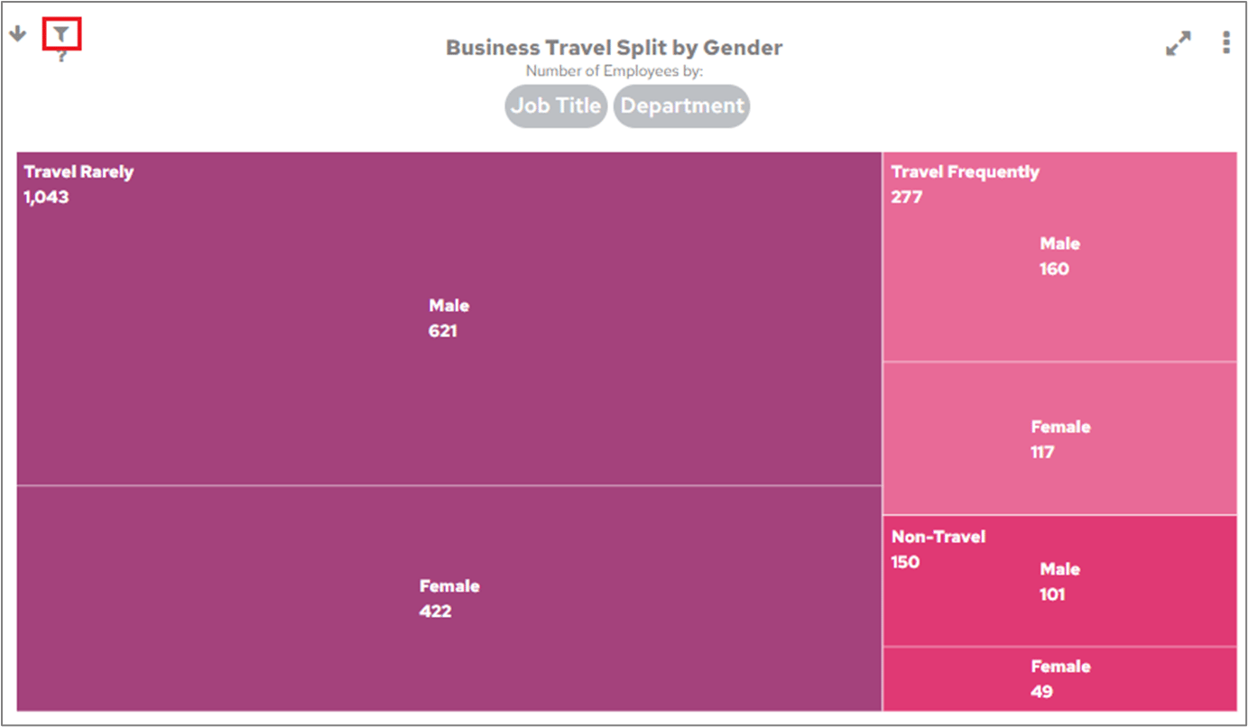
Spot when a FlowForma Analytics chart is filtered using the icon on its cell, and click it to view whether the filter comes from the chart or a category object.
Charts may already contain a filter that was added when the chart was created. If you see an icon like this at the top-left of a chart cell on the Dashboard: