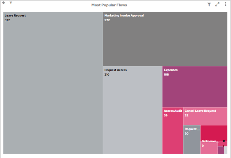
Most popular flows
Accessing the chart
The Most Popular Flows chart is available to add to your dashboard from the Home category.Filter
One or more YearsTarget audience
Operations management, Automation championsChart type
Tree mapInterpreting the data
This shows which Flows are used most frequently and which ones are used less frequently. For frequently used Flows, it indicates where Flow improvements might deliver the most payback. For less frequently used Flows, it may indicate that more effort is needed to drive user adoption.Drills down to
Flow usage pattern chartFlow usage pattern (Spline)
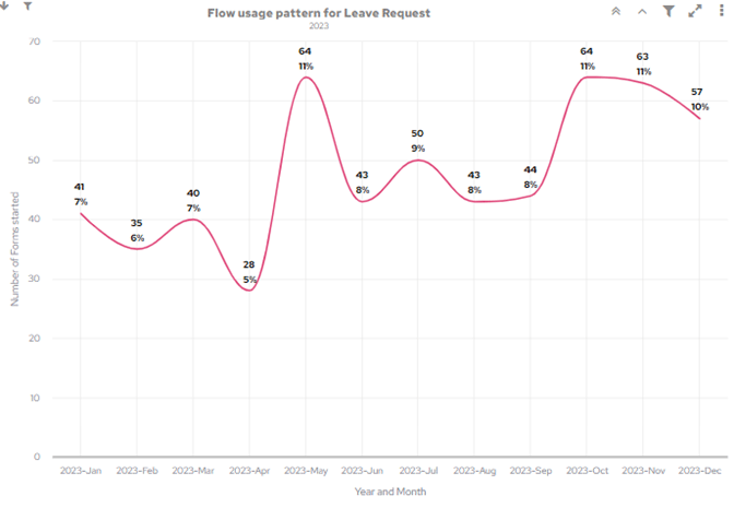
Accessing the chart
This chart is available as a drilldown from the Most Popular Flows chart.Filter
One or more YearsTarget audience
Operations management, Automation championsChart type
SplineInterpreting the data
This chart shows the usage pattern of a Flow throughout the year. With a previous year selected, this chart can reveal patterns of activity in the business, which can be used to plan operational resourcing. With the current year selected, this chart lets you monitor current form volumes, which can help inform timely resourcing decisions.Drills down to
Clicking on the highlighted data points will drill down to a list of forms.Power users
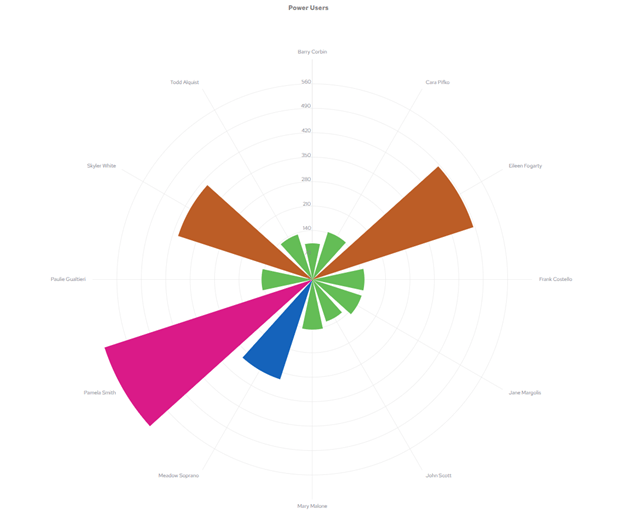
Accessing the chart
The Power Users chart is available to add to your dashboard from the Home category.Filter
One or more YearsTarget audience
Operations management, Automation championsChart type
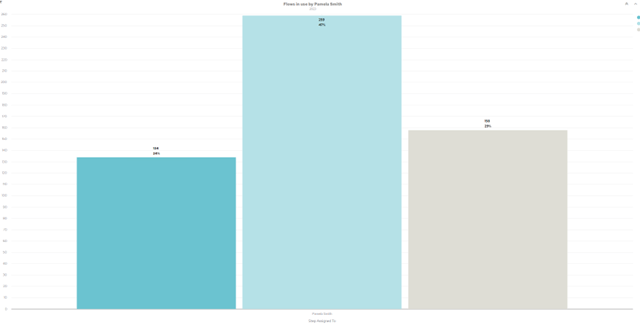
Wind RoseInterpreting the data
This chart shows you who in the organisation has been assigned the most steps in a year, which indicates who is participating in automated processes the most. These power users are a great source of suggestions for Flow improvements and Form design, to make your workflows even more efficient. Power Users can also be good candidates to train up as Flow builders, as they’re already familiar with FlowForma.Drills down to
Flow Usage chartFlow usage chart
Accessing the chart
This chart can be drilled down to from a number of higher level charts, namely from the Power Users, Occasional Users and User Flow Participation charts.Filter
One or more YearsTarget audience
Operations management, Automation championsChart type
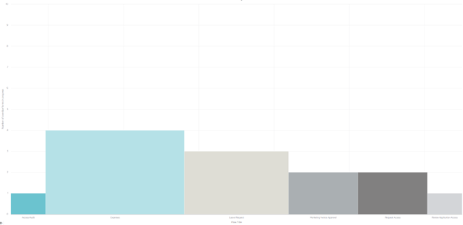
Bar ChartInterpreting the data
This chart shows you what Flows your users are using. The information shown varies depending on where the chart was drilled down from.- If accessed from the Power Users chart, the Flow Usage chart will show Flows where the user has been assigned more than 100 steps in the time period selected.
- If accessed from the Occasional Users chart, the Flow Usage chart will show Flows where the user has been assigned between 10 and 99 steps in the time period selected.
- If accessed from the User Flow Participation chart, the Flow Usage chart will show all Flows the user has been assigned a step in the time period selected.
Drills down to
No further drill down.Occasional users chart
Accessing the chart
The Occasional Users chart is available to add to your dashboard from the Home category.Filter
One or more YearsTarget audience
Operations management, Automation championsChart type
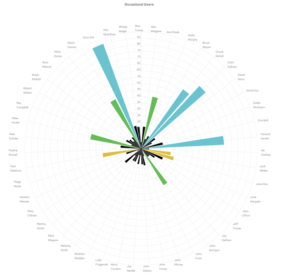
Wind RoseInterpreting the data
This chart shows you who in the organisation, outside of the Power Users, has used process automation over the selected time period. The larger the coloured triangle associated with a user, the more steps they’ve been assigned in the selected time period. Users who are only occasionally using Flows are a good source of suggestions for new Flows, and may be in departments that have little automation to date.Drills down to
Flow Usage chartOverdue forms in progress chart
Accessing the chart
The Overdue Forms in Progress chart is available to add to your dashboard from the Home category.Filter
One or more YearsTarget audience
Operations managementChart type
Variable Width BarInterpreting the data
When a Flow is defined in Flow Builder, you can set an estimated completion time for the Flow and for each individual step. This setting is used to calculate the estimated completion date for the Flow and for each step. Note that a Form can be overdue while a step is still on time. This chart shows you forms that are currently in progress that are overdue.Drills down to
Overdue Forms chartOverdue forms chart
Accessing the chart
The Overdue Forms chart is only accessible via drill down from the Overdue Forms in Progress chart.Filter
One or more YearsTarget audience
Operations managementChart type
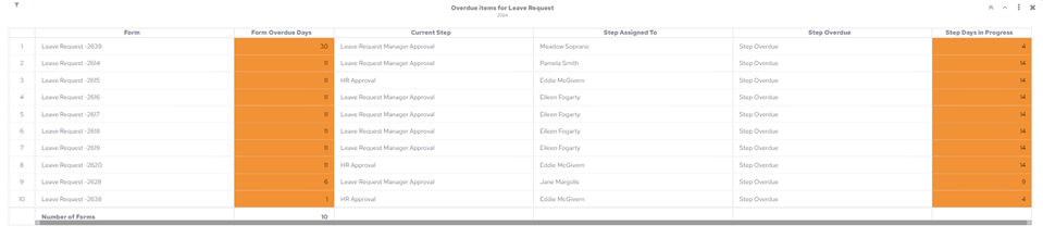
TableInterpreting the data
The chart provides a list of Forms that are overdue. It highlights the number of days each Form is overdue, and the number of days it’s been overdue at its current step.Current workload chart
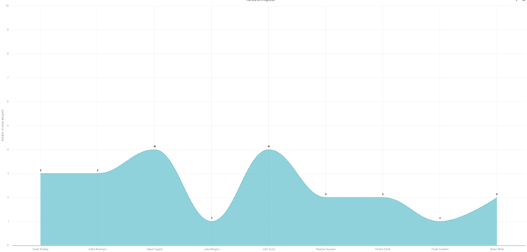
Accessing the chart
The Current Workload chart is available to add to your dashboard from the Home category.Filter
One or more YearsTarget audience
Operations managementChart type
Spline AreaInterpreting the data
The chart shows steps currently in progress across all Flows and who they’re assigned to. It illustrates the distribution of work across all process participants and highlights potentially unequal distribution of work, or where backlogs are occurring.Drills down to
Workload Details chartWorkload details chart
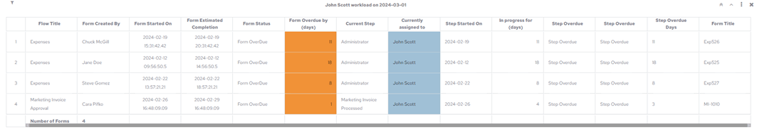
Accessing the chart
The Workload Details chart is only available via drill down from the Current Workload chart.Filter
One or more YearsTarget audience
Operations managementChart type
TableInterpreting the data
The chart shows key details of forms and steps that are in progress. It highlights whether items in progress are overdue at the current step, and shows the number of days an item has been in progress.Drills down to
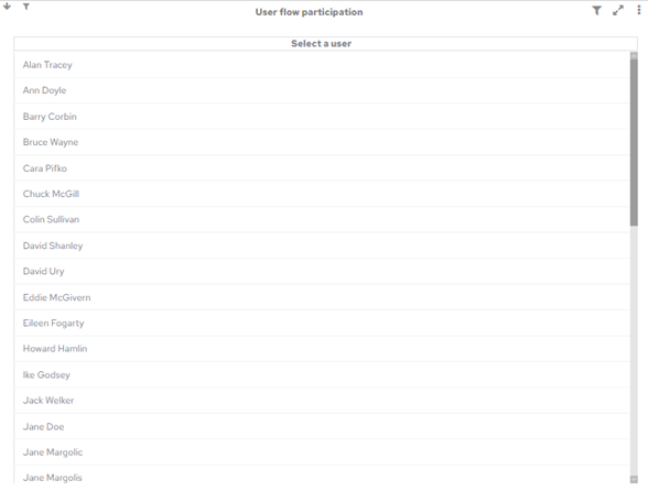
No further drill down.User flow participation