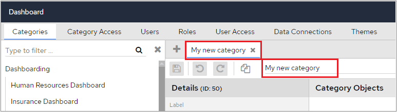
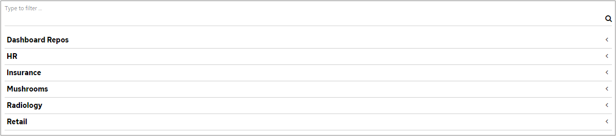
If you’ve clicked on multiple categories and see something like this, the changes that you make will relate to the highlighted category, in the screenshot below this would be Insurance Dashboard.

Example
The following screenshot shows that HR.Job Role has been added to ‘My new category’.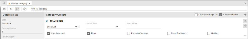
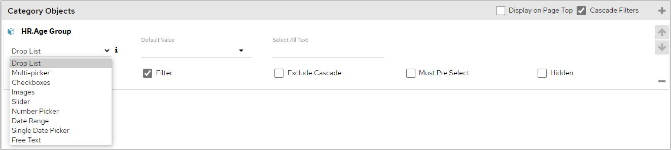
Drop List
The most used, and default, filter type is the Drop List. This allows the selection of a single item at a time. At the top of the Drop List, there is often an ‘All’ option. When ‘All’ is selected this filter is ignored and information for all items in the drop-down list will be displayed.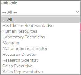
When a single item is selected, an ‘EQUALS’ filter will be used.
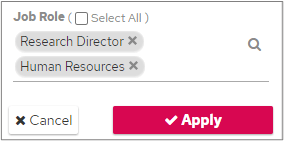
Multi-Picker
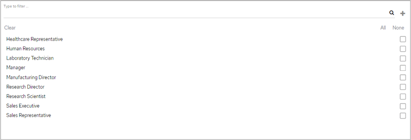
This is like a Drop List but allows multiple items to be selected at once. Clicking into the text area opens the Search Panel. You can then either select an item or start typing to search. When using the search field, you can enter any part of a word. The search field uses a ‘contains’ search, not a ‘starts with’ search.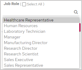
Checkboxes
Checkboxes work similarly to multi-pickers in that you can select multiple values from the list. As opposed to the multi-picker, all the options are laid out on the category filter panel. This would be a good option to use when the total number of potential options is limited.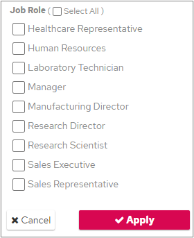
Images
This category object type allows for an image to be associated with each potential data value, that will then be displayed on the category filter tab.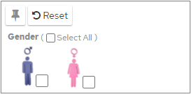
- Add the images to the logo directory (tomcat/webapps/panMISDashboardResources/images)
- The images must be named the same as each data value option they represent. If a selectable value is Male, the name of the image must also be Male.
- The file extension defaults to png.
IMAGE_REPOSITORY_DIRECTORY.
The file extension can be changed by adding a system variable for IMAGE_RESOURCE_EXTENSION.
Similar to a Multi-Picker, this option also uses an ‘IN’ filter.
Slider
This filter type allows you to move a slider to do a ‘between’ filter on values in the data set. In the following example, data will be filtered to only show details for the period between 31/05/2016 and 11/03/2018.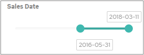
Number picker
This filter works in the same way as a drop list but specifically for number-based dimensions. Click the up or down to change the number or alternatively, type the number into the field. Click Apply to filter the dashboard.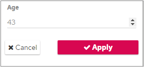
This option uses an ‘EQUALS’ filter.
Date Range
The date range filter must be used on a date object and works by inputting from and to dates, or by selecting the date from a Calendar, which are then passed into a ‘between’ filter on the chart.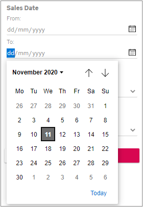
Single Date Picker
Unlike the date range filter, this option only allows you to select one date value from the data set to filter by. You can either type the date in manually or click the calendar drop-down to select from a calendar.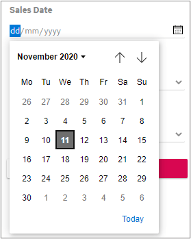
Free Text
This allows for the use of free text within the filter box. Enter text, as shown below, and click the Apply button.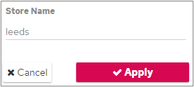
This uses a LIKE filter and therefore cannot be used to return specific values. It will also be slower on larger tables.
Default Value
When a ‘Default Value’ is specified: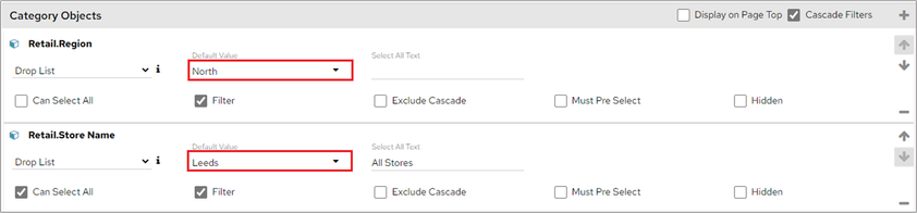
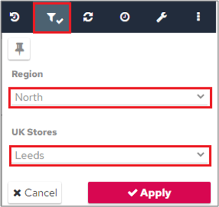
- Drop List
- Number Picker
- Date Range
- Single Date Picker
- Free Text
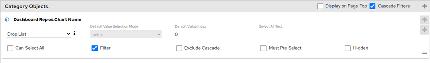
Default Value by index
From November 2023, the ‘Drop List’ category object type also supports defining the default value by index in the list. For this category object type, a dropdown is provided to choose a default value mode (Text or Index). Once you select ‘Index’ as the mode, enter the index value in the Default Value Index box. Index starts at 0. For example, if the options are ‘Test’, ‘Dev’, and ‘Sales’, index 0 is ‘Test’, and index 2 is ‘Sales’.