The visual form designer is a new and improved version of the custom layout. To open the visual form designer, open the flow designer and select the visual form designer icon from the toolbar. Visual form designer icon in the flow designer toolbar The visual form designer now loads. Click the pen icon in the top-right corner to edit the header of the form. Visual form designer with pen icon to edit the header You can add properties from the form by clicking add form property. Click the check-mark to save once you’ve made all the required changes to the header. Click the reset button if you want to revert to the original header layout. Header editing toolbar with add form property option If you want to change the header’s layout, you can add images, links, and form properties (e.g. title, author, etc), and you can also drag questions from the main body of the form as long as you have editing enabled for the main body. If you drag a question from the form into the header, the question is not moved from the form: it simply creates a copy in the header. Header layout toolbar options If you are creating a large header with multiple lines of text, you can drag the toolbar at the top down using the || symbol on the left. Header toolbar drag handle Note: remember to save all changes exactly as you would when making changes to the main body of the form’s layout. Header save options You can add a logo to your form by clicking choose file and selecting your image. It automatically uploads the image to the FlowForma asset library. Choose file option to add a logo You can edit the size and define the height and width needed, as well as provide alternative text, by selecting the logo and then selecting the picture icon from the toolbar. The alternative text is visible when you hover over the image and can also be picked up by accessibility tools. Picture icon and size editing options for the logo Image size and alternative text settings To edit the custom layout of a step, click the step you want to customise. You can add or delete columns and rows, or even merge cells, with the buttons at the top of the visual form designer. Step layout buttons on top of the visual form designer Reset step layout changes: this will reset all recent changes and revert to the last saved version
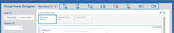
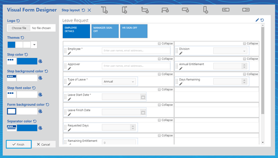
Delete step layout: this will delete all changes and revert to the default step layout
Add a column to the left: this will insert a new column to the left of the selected section
Add a column to the right: this will insert a new column to the right of the selected section
Add a row above: this will insert a new row above the current one
Add a row below: this will insert a new row below the current one
Delete a row: this will remove the selected row from the layout
Delete a column: this will remove the selected column from the layout
Merge columns to the left: this will combine the current column with the one on the left
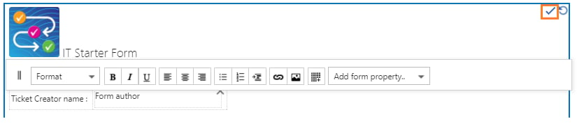
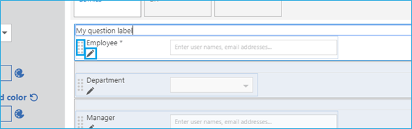
Merge columns to the right: this will combine the current column with the one on the right
Use the marker dots on the left of the question to drag questions to where you want them to appear on the screen. You can also add labels above your questions, or click the pen to edit the question definition.
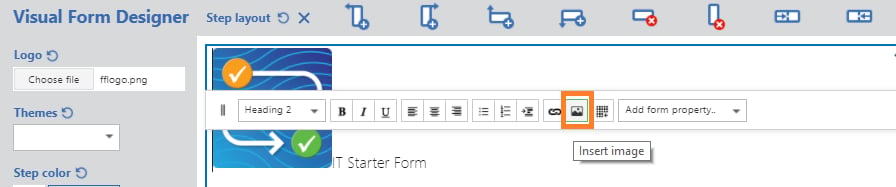
 Marker dots and pen icon on a question Click at the end of a question if you want to add new or existing questions to the form. You can tick the collapse box to minimise some questions in your form. Add question and collapse options

Themes

To apply a custom theme to your form, select a pre-defined template from the themes drop-down, or apply the required colors directly to each section. At any point, you can revert your changes by clicking the reset button. Themes drop-down with color options There are five different options, as follows: Step color: you can select this to change the color of the steps on the top of the form
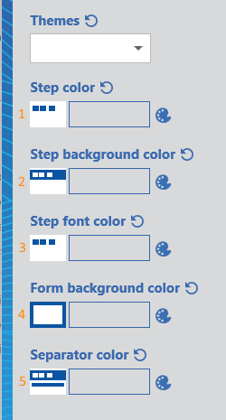
Step background color: you can select this to change the color of the background around the steps
Step font color: you can select this to change the color of the text within each step title
Form background color: you can select this to change the color of the background around the form
Separator color: you can select this to change the color of the separator fields within the form
Each of these options has a round arrow icon to reset it to default, or a color palette icon to open the color selector. Once you’ve finished all your changes, click finish. Form with a custom theme applied