- CWM Groups: used to group different sites/flows for different departments/teams.
- CWM Queues: used to display forms you have “awaiting my input” and/or “created by me” and/or “Completed” from different sites/flows in one location, groups into “queues”.
- CWM Reports: used to display information for different flows/sites.
- CWM Links: used to put useful links in one place for users to easily navigate between pages.
- CWM Newsfeed: used for members of a group to communicate in real time.
Setup
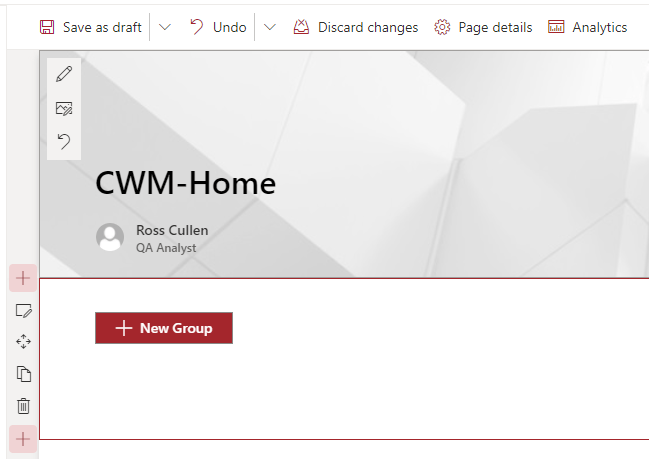
While not mandatory, we recommend you create 2 SharePoint site pages to use CWM. Home page: this page acts as a landing page for CWM, where the “CWM Groups” webpart is added and configured.Data page: after clicking a group tile, users are redirected to this page where the “CWM Queues”, “CWM Reports”, “CWM Links”, and “CWM Newsfeed” webparts are added, and display the data configured for the specific group they clicked.
CWM Groups
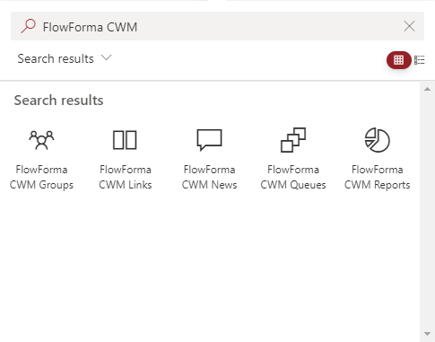
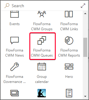
You use this webpart to define the group details to be displayed on the CWM Home page. The group also contains tabs to configure Queues, Reports, Links and the Newsfeed. To add the webpart, edit the SharePoint page you use as the home page. With the page in edit mode, click the + icon to add a webpart.Available webparts are now displayed. Search for “FlowForma CWM” to find all CWM webparts, then select the FlowForma CWM Groups webpart.
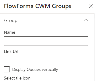
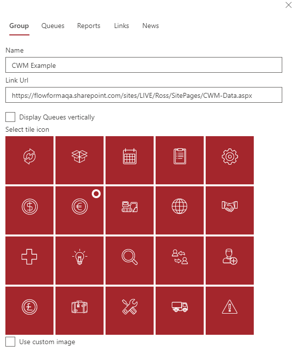
Link Url: This is the link to the page where you want the queues, reports, and links you add to the group displayed. You need to add the relevant queues, report, and links webparts to this page to display them.
Display Queues vertically: the queues webpart displays queues horizontally by default; checking this box displays queues vertically.
Select tile icon: To display the tile for the group with an image, you can select one from the provided gallery, or check “Use custom image” to enter a URL for an image hosted elsewhere. Once you’ve added the initial group details, click the X button to close the panel, then click the edit icon on the group to add the remaining configuration needed.
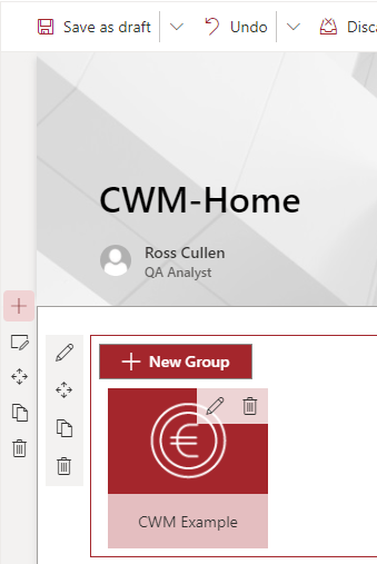
Example
Queues
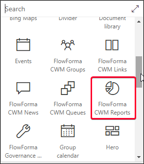
Queues are lists of forms. You define which forms are included in a queue in the group settings; you can add multiple queues to a group as required. The queue is then displayed on the data page you set as the Link Url for the group. To add the webpart, edit the webpage and click the icon. Available webparts are displayed.
Defining queues
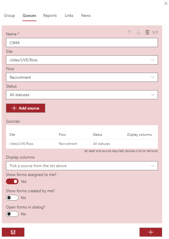
To add a queue, with the Group webpart in edit mode, expand the Queues section in the panel on the right of the screen.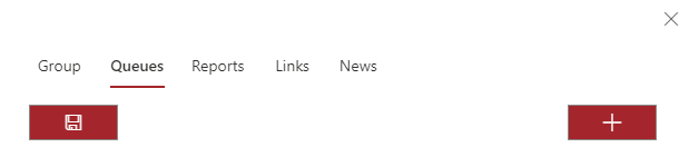
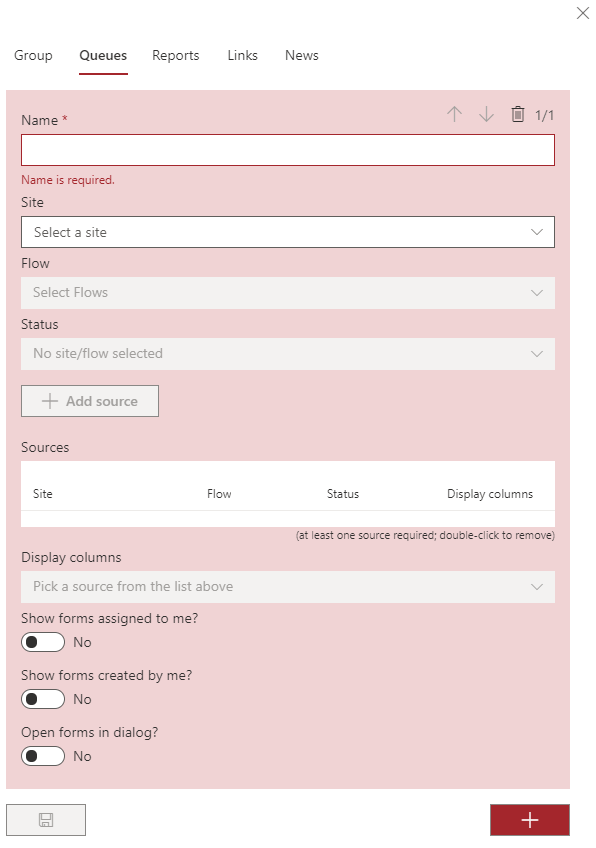
Site: This drop-down contains all the sites you have permissions for; select the site that contains the flow you want to include in the queue.
Flow: This drop-down contains all the flows present on the site selected above; select the flow you require.
Status: The status drop-down includes the names of all the steps in the flow selected above, as well as All statuses, All statuses but Completed, Completed, and Rejected. Select the status of the flow you want to include in the queue.
Add source: Once you have selected the site, flow, and status, click the + Add source button; multiple Site/Flow/Status combinations can be included in the queue.
Show forms assigned to me?: If left as No, all forms matching the filters are displayed; if changed to Yes, only forms assigned to the currently logged in user that match the filter(s) are displayed.
Show forms created by me?: If left as No, all forms matching the filters are displayed; if changed to Yes, only forms created by the currently logged in user that match the filter(s) are displayed.
Open forms in dialog?: if left as No, clicking a form title redirects the user to that form; if changed to Yes, forms open in a new dialog displayed on the page without redirecting the user from the page. When you have finished setting up the queue, click the Save icon to save the queue. To add another queue, click the + icon and follow the process above. Once you’ve added all the queues you require, you can move on to another tab to configure them, or close the configuration panel and click the publish/republish button on the SharePoint page. When you click the Group tile, the page containing the queue is displayed.
Example
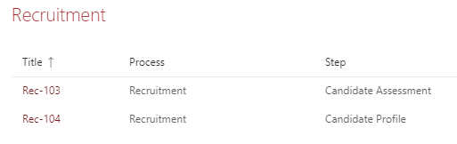
If you click on a form title the form will be opened.
Reports
Reports are used to display form data either graphically or in tabular form. The content of the reports is defined in group settings; the report is then displayed on the page entered in the group settings Link Url. You will have to add the reports webpart to this page to generate the reports. To add the webpart, edit the webpage and click the icon. Available webparts are displayed.
Reports tab
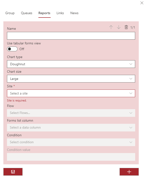
Clicking the Reports tab in the CWM Groups configuration panel opens the following screen.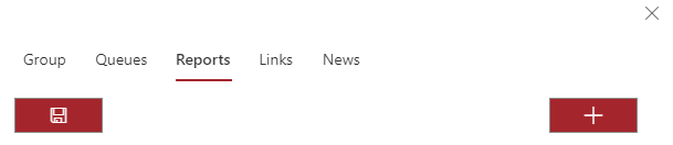
Option 1 - Charts
- Bar
- Horizontal bar
- Doughnut
- Line
- Pie
- Polar
- Radar
Site: The site from which you want to select the flow to include in the report.
Flow: A drop-down list containing all the flows contained in the site selected above. The drop-down has check boxes, so you can select multiple flows to include in a report. If no flows are selected, all flows from the site are included in the report.
Forms list column: Drop-down including all the columns from the forms list of the site selected above:
- The standard list columns, common to all FlowForma sites.
- Any published questions that are specific to the site.
- Equal
- Not equal
- Blank
- Not blank
- Contains
- Not contains
- Greater than
- Less than
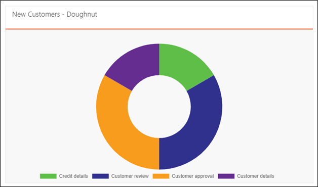
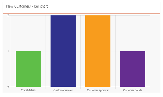
Example of charts
Report definition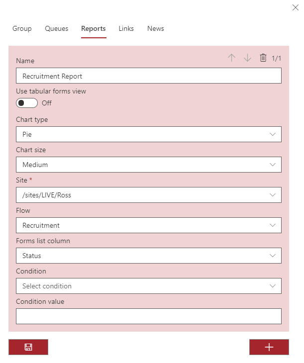
Report - Bar chart
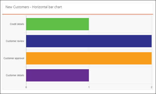
Report - Horizontal bar chart
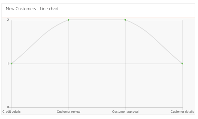
Report - Line chart
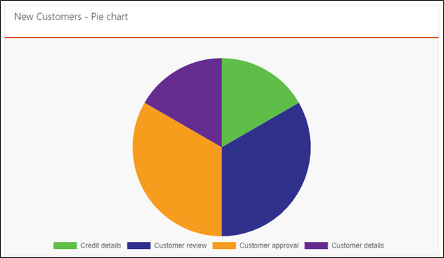
Report - Pie chart
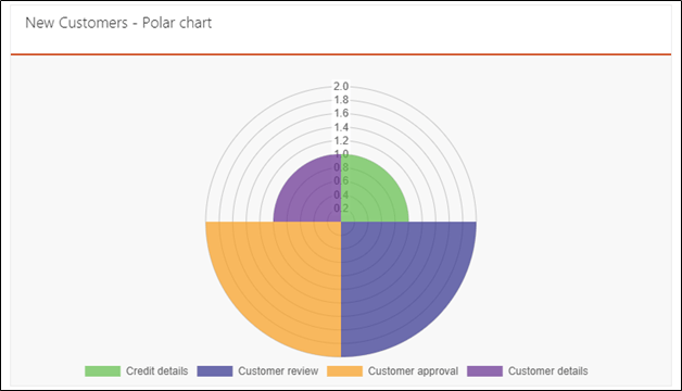
Report - Polar chart
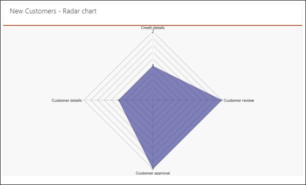
Report - Radar chart
Option 2 - Tabular reports
The process to add a tabular report is similar to adding a standard report above. Select ‘On’ for Use tabular forms view, and the report editor is now displayed.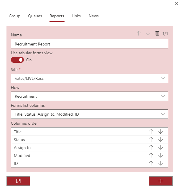
- The standard list columns, common to all FlowForma sites.
- Any published questions that are specific to the site.
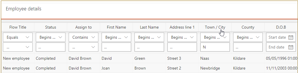
Example of tabular report
The site and flow have been selected from the relevant drop-down lists. Forms list columns, both standard list columns and columns for published questions, have been selected and ordered. The tabular report is displayed as below.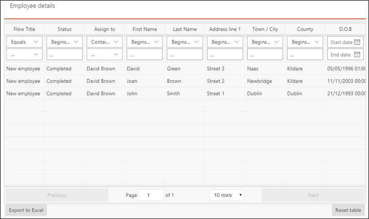
Form properties
| Property | Column type | Filter value | Begins with | Ends with | Equals | Not Equals | Contains | Not contains | Blank | Not blank | Start date | End date | From | To |
|---|---|---|---|---|---|---|---|---|---|---|---|---|---|---|
| Title | Link | Enter | y | y | y | y | y | y | y | y | ||||
| Status | Text | Enter | y | y | y | y | y | y | y | y | ||||
| Assign to | Person | Select checkbox(s) | y | y | y | y | y | y | ||||||
| Modified | Date | Date picker | y | y | ||||||||||
| ID | Number | Enter | y | y | ||||||||||
| Compliance Asset Id | Text | Enter | y | y | y | y | y | y | y | y | ||||
| Flow Title | Text | Select checkbox(s) | y | y | y | y | ||||||||
| Parallel status | Text | Enter | y | y | y | y | y | y | y | y | ||||
| Submit date | Date | Date picker | y | y | ||||||||||
| Parallel Assign To | Person | Select checkbox(s) | y | y | y | y | y | y | ||||||
| Assign original to | Person | y | y | y | y | y | y | |||||||
| Comments | y | y | y | y | y | y | y | y | ||||||
| Rejected | Text | Enter | y | y | y | y | ||||||||
| Completed | Text | Enter | y | y | y | y | ||||||||
| Created | Date | Date picker | y | y | ||||||||||
| Modified by | Person | Select from checkbox | y | y | y | y | y | y | ||||||
| Version | Text | Enter | y | y | y | y | y | y | y | y | ||||
| Attachments | y | y | y | y | y | y | y | y |
Published questions
| Question type | Column type | Filter value | Begins with | Ends with | Equals | Not equals | Contains | Not contains | Blank | Not blank | Start date | End date | From | To |
|---|---|---|---|---|---|---|---|---|---|---|---|---|---|---|
| Single line of text | Text | Enter | y | y | y | y | y | y | y | y | ||||
| Calculated - Number | Text | Enter | y | y | y | y | y | y | y | y | ||||
| Calculated - Text | Text | Enter | y | y | y | y | y | y | y | y | ||||
| Date and time | Date | Date picker | y | y | ||||||||||
| Choice | Text | Enter | y | y | y | y | y | y | y | y | ||||
| File upload | Text | Enter | y | y | y | y | y | y | y | y | ||||
| File links | Text | Enter | y | y | y | y | y | y | y | y | ||||
| Lookup | Text | Enter | y | y | y | y | y | y | y | y | ||||
| Multiple lines of text | Text | Enter | y | y | y | y | y | y | y | y | ||||
| Number | Number | Enter | y | y | y | y | y | y | y | y | ||||
| Person or group | Person | Select from checkbox | y | y | y | y | y | y | ||||||
| Yes No | Text | Select from checkbox | y | y | y | y | ||||||||
| Wet signature | Text | Enter | y | y | y | y | y | y | y | y | ||||
| Auto number | Number | Enter | y | y | y | y | y | y | ||||||
| Date of birth | Date | Date picker | y | y | ||||||||||
| Location | Text | Enter | y | y | y | y | y | y | y | y | ||||
| People picker | Person | Select from checkbox | y | y | y | y | y | y |
Retaining filters
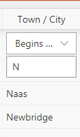
If you want the report to open with filters applied, you have to do the following: Set up the report normally by completing the report definition in the group settings. Select the tile of the group that contains the tabular report; the page should appear with the tabular report displayed. Click Edit on this page. Add filters to the tabular report as required. Click the publish/republish button to save the changes. Now the report is generated with the filters applied. Example: The following tabular report has no filters.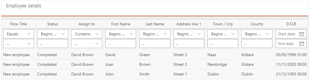
Reset table
If you have added filters or re-ordered columns and want to discard these changes and view the report as it was originally displayed, click the button.
Export to Excel
You can export the table to Excel by clicking the Export to Excel button. An Excel workbook is created containing all the columns and rows contained in the filtered report. The workbook created for the report above is displayed below.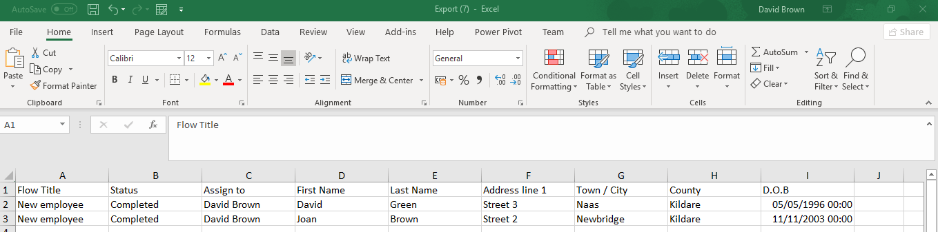
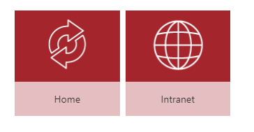
Links
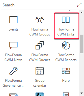
Links are used to direct users to other web pages by clicking a tile. The link properties are defined in group settings; the link is then displayed on the page entered in the group settings Link Url. You will have to add the links webpart to this page to generate the links. To add the webpart, edit the webpage and click the icon. Available webparts are displayed.
Select the FlowForma CWM Links webpart and publish the page to include the webpart.
Defining links
Expand the links section in the group settings.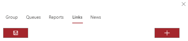
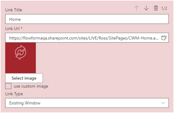
Multiple links can be added to any group
News
This section allows real-time communication between members of a defined group by including a Chat box for you to input comments into. Clicking the News tab displays the following screen.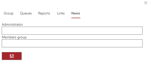
- Administrator: this is the person or group of people who will administer the newsfeed. The administrator(s) can delete any message in the newsfeed, regardless of who created it.
- Members group: this is the group of people who are allowed access to the newsfeed and able to take part in the chats.
Using the news feature
All users included in the Members group are able to add to the chat. To enter items into the chat, type something where the text ‘Chat’ is displayed and press enter; your comments are now visible to everyone in the Members group when they look at the newsfeed.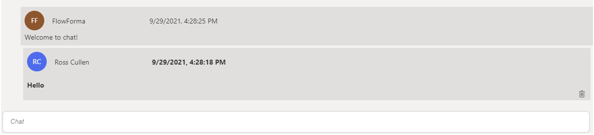
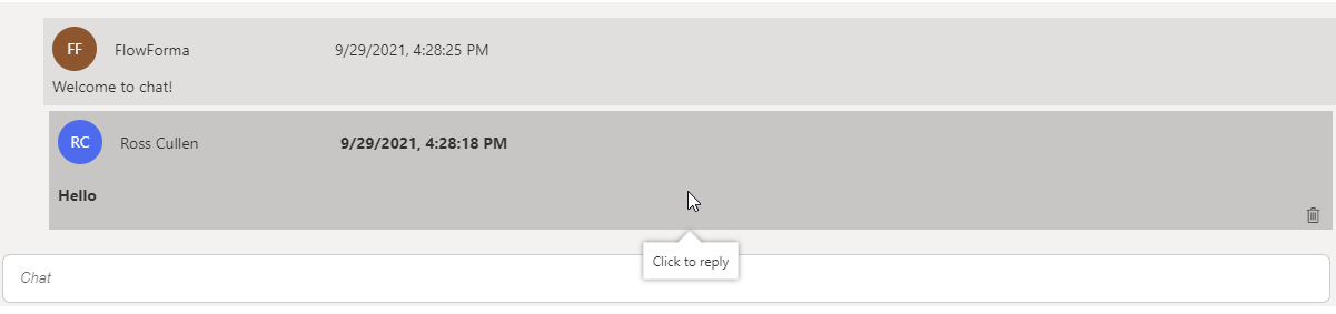
Notifying specific members
If you want to notify a specific member of the group that an item added to the chat requires their attention, type @ in the Chat field. A search box is now displayed. Type at least the first three characters of a name and available people are displayed. Select the person required; a link to that person is now added to the Chat. You can add further text to the chat if required, then press enter. When the item has been entered into the Chat, an email notification is sent to the person entered in the chat, with a link to the conversation.Linking the Chat to forms
You may want to discuss an issue concerning a particular FlowForma form. To do this, type @ into the Chat field; the same pop-up as above is displayed. If you start typing the first few characters of a form title, forms with a matching title on sites included in queues defined on the site are displayed, showing the form title and the site containing the form. Select the form required; a link to the form is now added to the chat, allowing chat members to access the form directly from the chat.Deleting items from the Chat
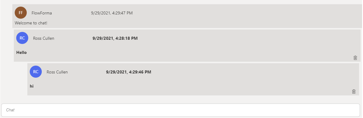
This option is only available to the user or users defined as Administrators in the Newsfeed definition described above. If you are an admin, in the bottom right-hand corner of the Chat box you see the trash can icon. When you click the trash can, a pop-up appears to confirm the deletion of the item. Any chat item can be deleted by admin users:- Single items not forming part of a conversation are deleted when the trash can is clicked.
- Single replies in a conversation (children) are deleted when the trash can is clicked.
- The entire conversation is deleted when the trash can on the first item in a conversation (parent) is clicked.